Peaks is a visualization of Swiss mountain peaks by Raphael Schaad, a designer at the MIT Media Lab.
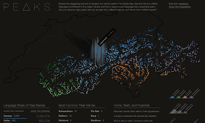 He uses four colors to distinguish the language (there are four official languages in Switzerland) of each name. In addition to color (hue) he also uses lightness (value) to represent height. The highest peaks are almost white making the language more difficult to determine. As you hover over a peak, you get the name and height of each one.
 There is an About this Visualization link you can click to get some insight into Raphael's design process. Here is a quote about the stories he looks to tell.
 I like way he presents the legends,
 and the supplemental language details.


The first narrative explores the impact language has on naming (e.g. Romansh’ names have much wider reach than the region this language is spoken in), the second story shows common names (similar to almost every U.S. state having a Springfield), and the third one highlights three colors as common origins for names. Each of these narratives is also interactive and tied to the central map.


1 comment:
that is interesting, but perhaps it might be even better expressed through this sort of an interface? http://coolmaps.esri.com/Dashboards/CrimeTrends/
Post a Comment